
Typeography
Typography guidelines to effectively support our brand identity.
Official Typefaces
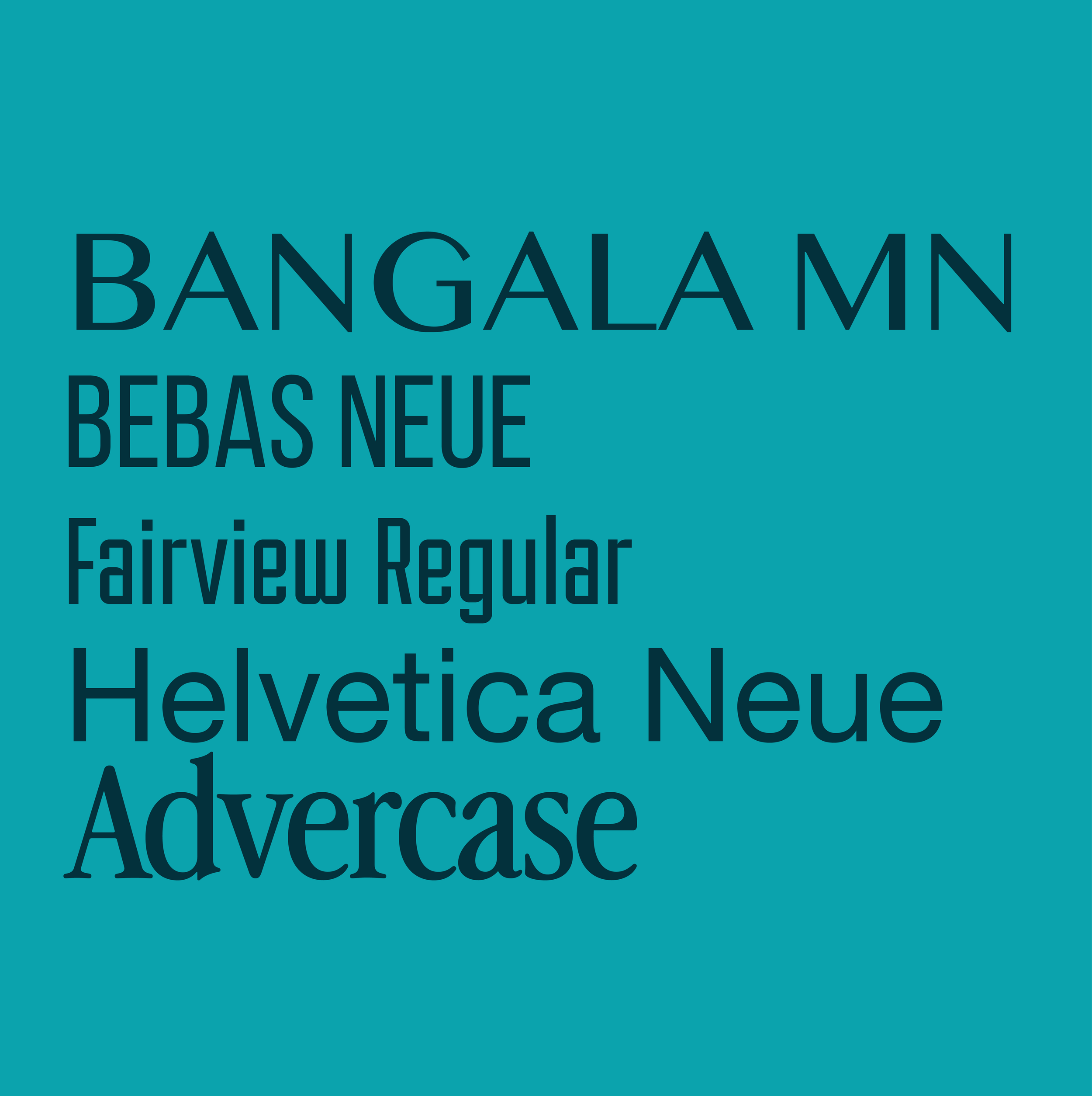
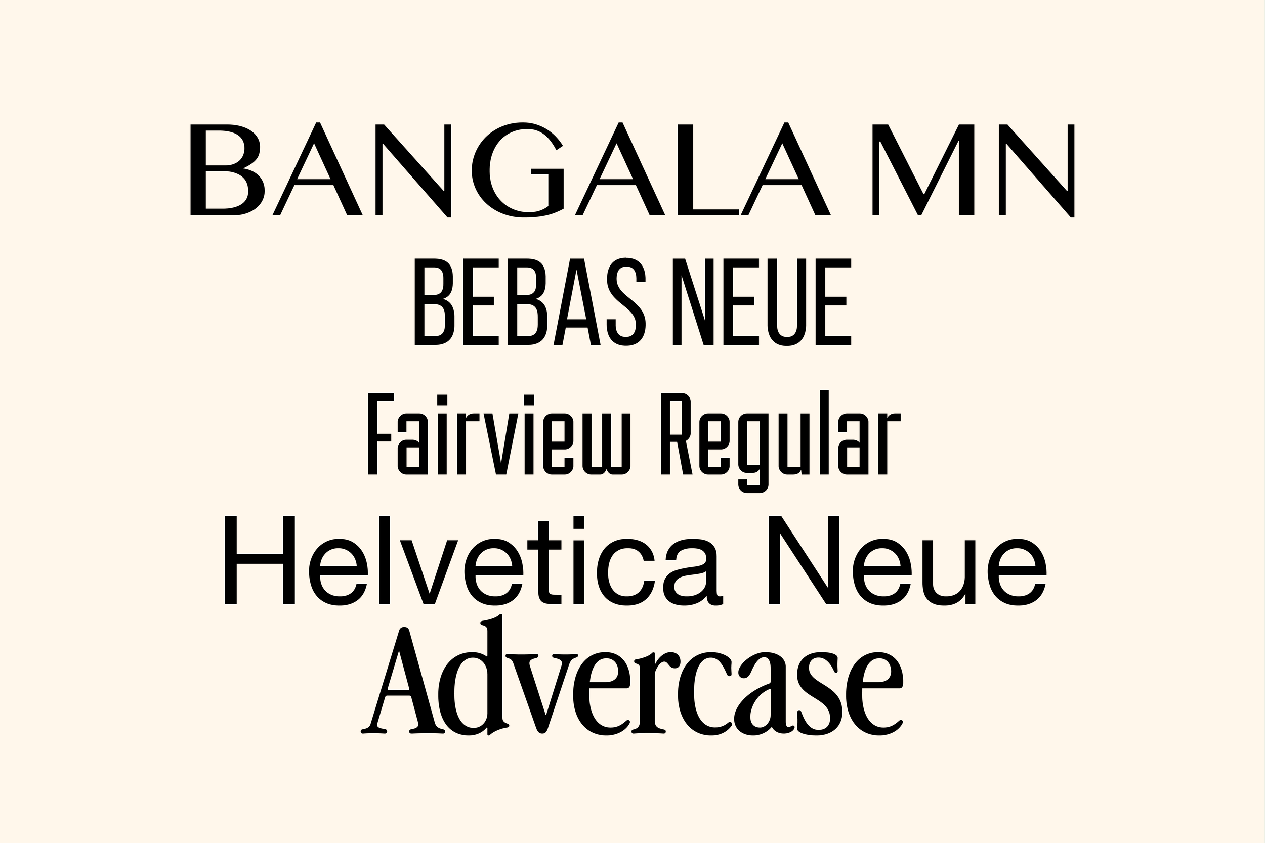
The following official typefaces are used for district communications and branding.
We continue to create designs and further establish our brand while refining our typeface usage. You can expect specific guidelines for further typeface rules and the addition of new typefaces in subsequent versions of the style guide.
Downloadable typeface files can be found in our Brand drive.
-
Bangala MN is the typeface used in our main district logo.
The use of Bangala MN is limited to our logo only.
-
Bebas Neue is a typeface primarily used for headlines and bold design elements.
Bebas is a versatile typeface family with uniform clean lines and elegant shapes perfect for web and print uses.
-
Fairview is a condensed industrial sans serif. The shape and lines of this particular font compliment our district architectural design language. You will see this font primarily used in our district buildings and signage.
-
Helvetica Neue, is a reworking of the original Helvetica typeface.
It was redesigned to improve legibility and expanded to contain many additional weights and styles. With simple lines and uniform shapes, Helvetica Neue remains timeless and versatile. Helvetica Neue can be used for headlines, titles, and body text.
For certain cases, Arial is an appropriate substitute. Please reach out to our office for more information.
-
Advercase is the typeface primarily used for our Only At campaigns and more. This font is primarily limited to the communications office at the moment. Stay tuned for more updates on this typeface at a later date.
-
It is important to pair typefaces together in a way that provides
clarity, and consistency to our communications. There is also a hierarchical nature in pairings to keep in mind.
As a rule of thumb, pair typefaces that compliment each other such as a Serif Headline text with a Sans-Serif body text.
Due to the similarities of our typefaces, we recommend pairing by font weights and sizes.