
the GISD “style”
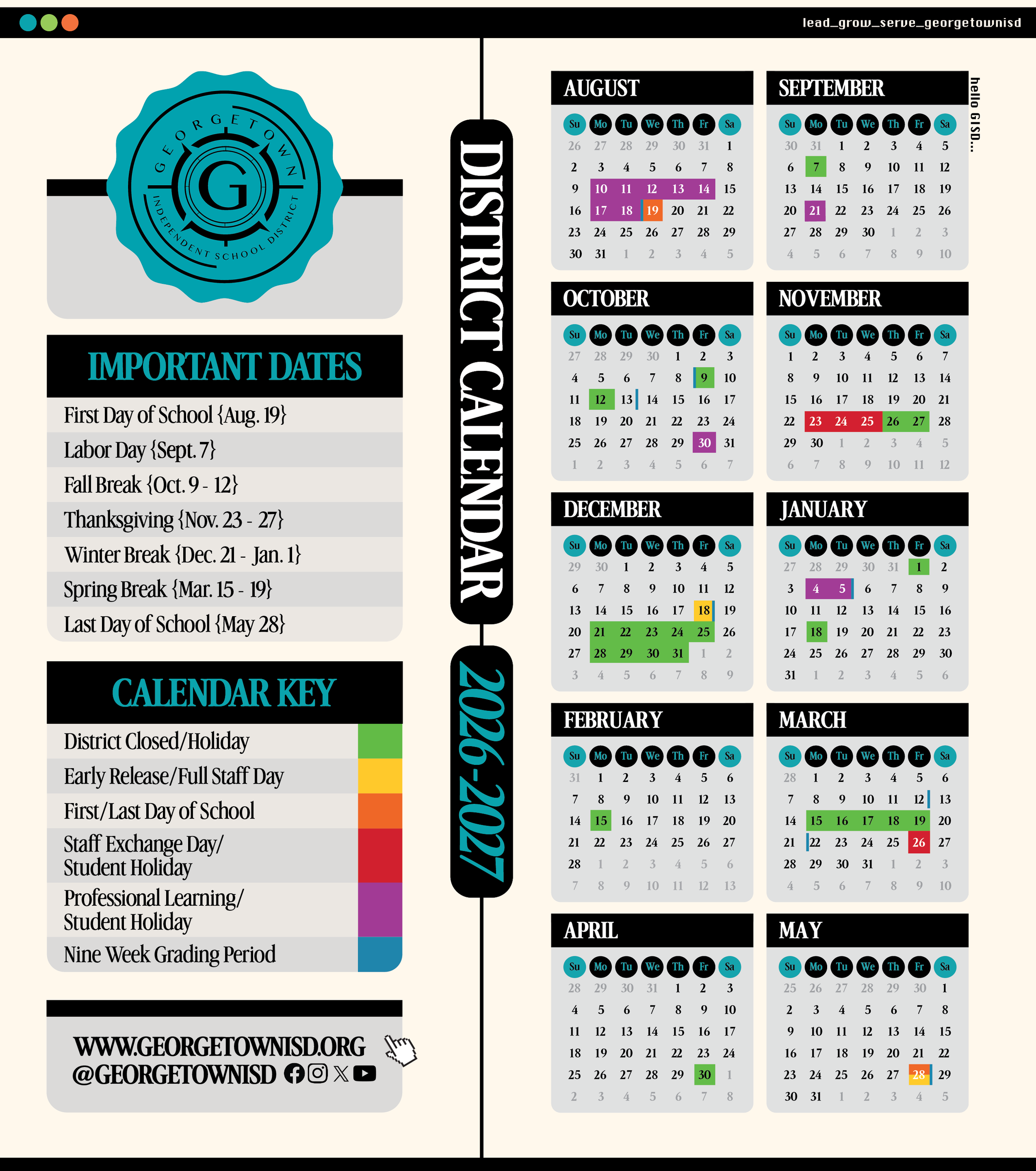
GISD’s style incorporates many neo-retro principals. We aim to combine nostalgic elements with modern sensibilities, breaking away from traditional education styling.
Additionally we aspire to provide our audiences with a definitive authoritative district voice, but with a playful twist.
High Contrast Typography: Large headings, usually in stark contrast with the background to provide an editorial feel or distinct voice. Secondary information is often displayed in clean compressed fonts to help flesh out designs.
Rounded Geometry: Containers and boxes tend to have rounded edges with a consistent radius. As we evolve our designs, we have moved away from rigid, hard-edged blocks. Our “badge” logo for example also incorporates soft scalloped edges to give a softer look.
Warm Base: We opt for warm “beige” or off-white backgrounds and avoid harsh white backgrounds on digital displays. For print projects we often incorporate the natural paper color as the base. These “softer’ backgrounds provide a sense of softness, nostalgia and playfulness to our designs.
Saturated Accents & Deep Blacks: Paired with our off-white backgrounds, we utilize highly saturated accent colors, and deep blacks to provide high contrast legibility to our projects.
Playfulness: While it is important the district serve as an authoritative voice, we also often incorporate a playful approach to many of our designs. From fun dynamic text choices, to colorful accents, it is important for our brand to also maintain a lighthearted touch with many of our designs.