
Logo
Logo guidelines to effectively support our brand identity.
Dos & Don’ts
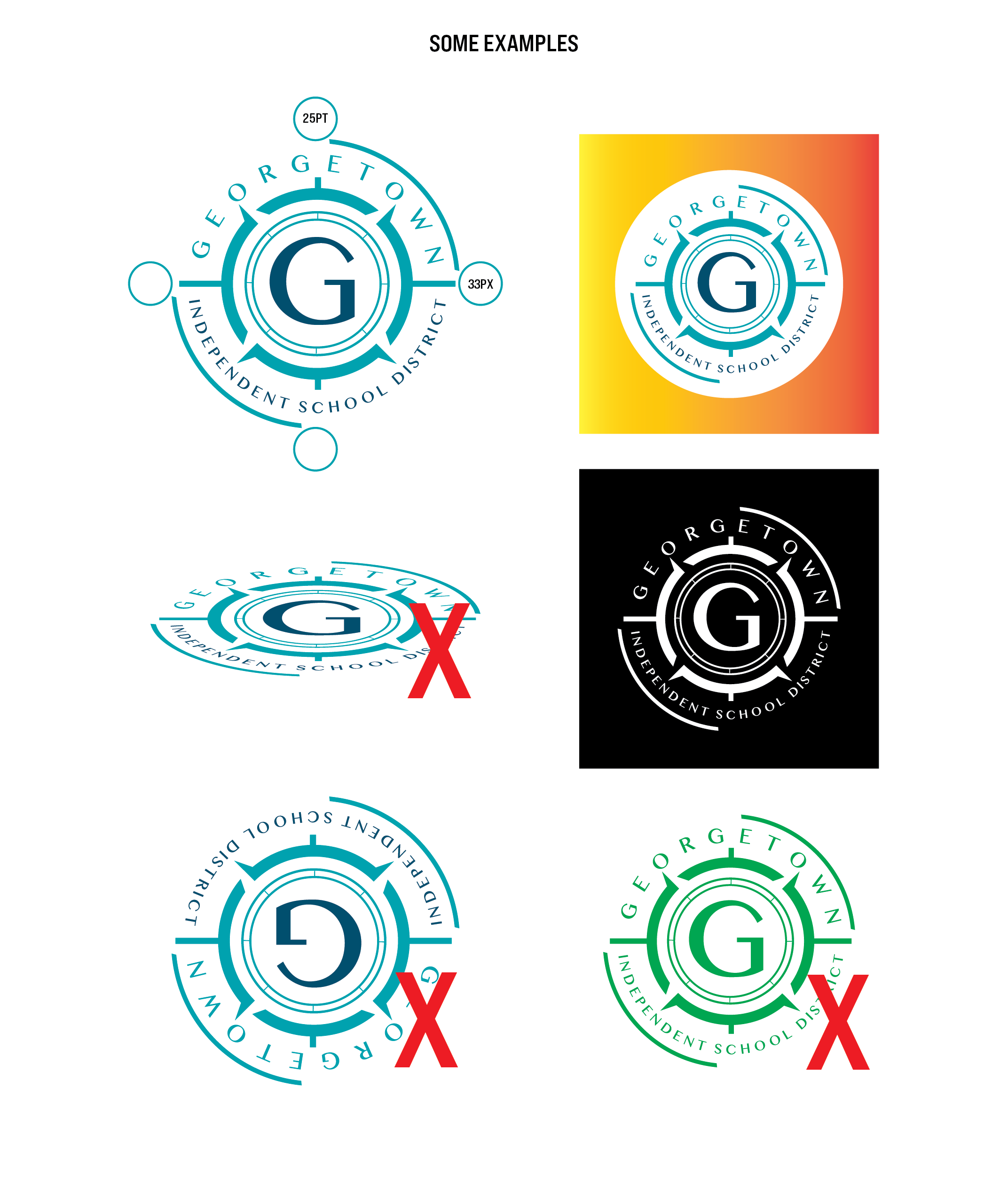
The following are best practices to follow when using our logo:
Always leave a suitable amount of space around the logo. Keep at minimum a 25 pt (33 px) space around the main logo.
Never stretch or skew the logo.
Do not change logo orientation.
Do not place standard logo on busy or complicated backgrounds. You may use alternatives such as the badge logo for such applications.
Do use black or white logo to contrast solid color backgrounds if needed. You can also use logos with solid backgrounds.
Never alter or change the color of standard logos.
Do not combine standard logo with external graphics or assets.
Do not change the font of the logo.
Sizing
When resizing our logo it is important that each element remains proportional.
You will have access to high quality format versions of our logo to use as needed. These versions allow for our logo to be scaled up or down correctly.
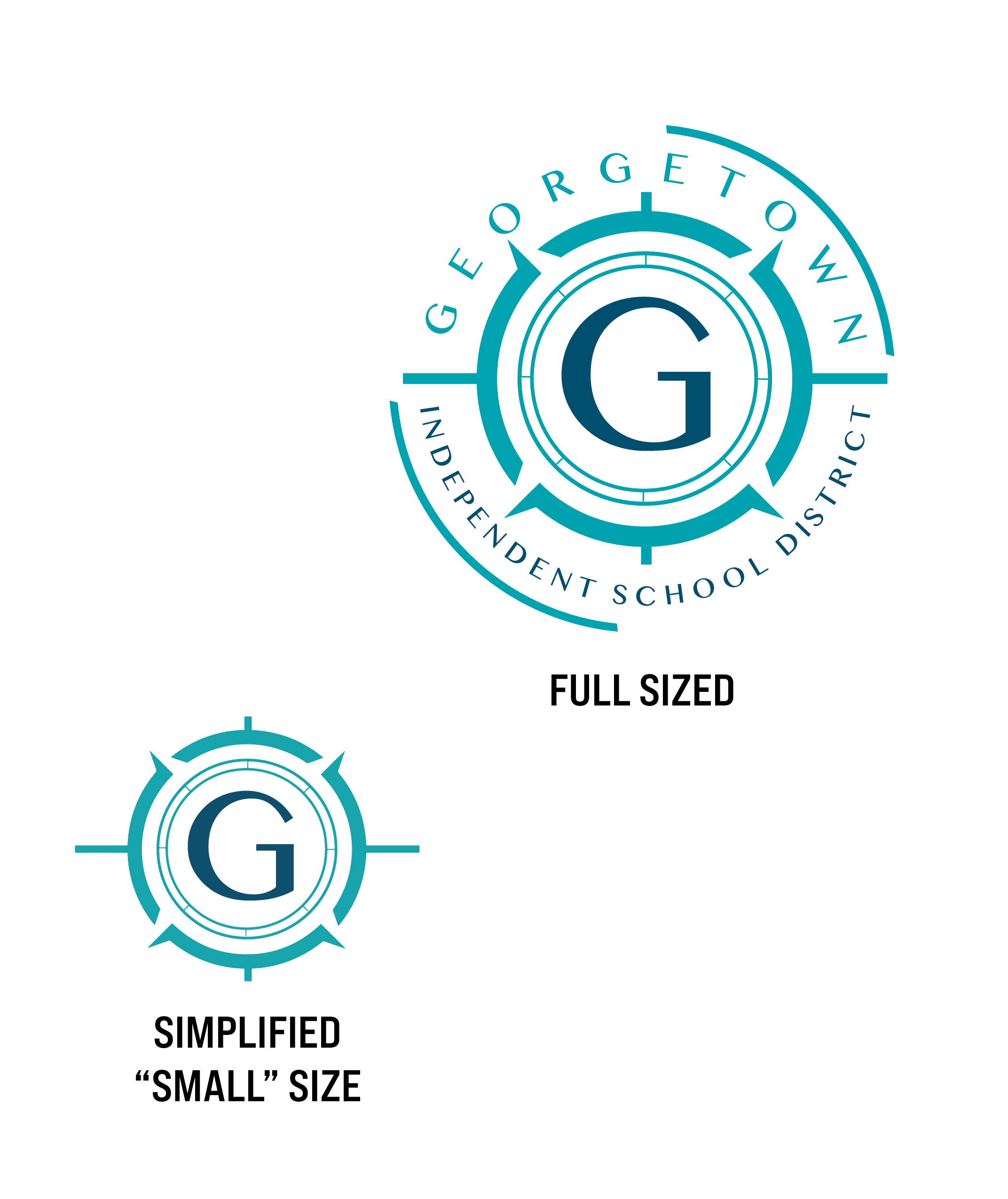
We have also provided versions of our logo better suited for small printing, embroidery or any job smaller than one inch.
Alternative Versions
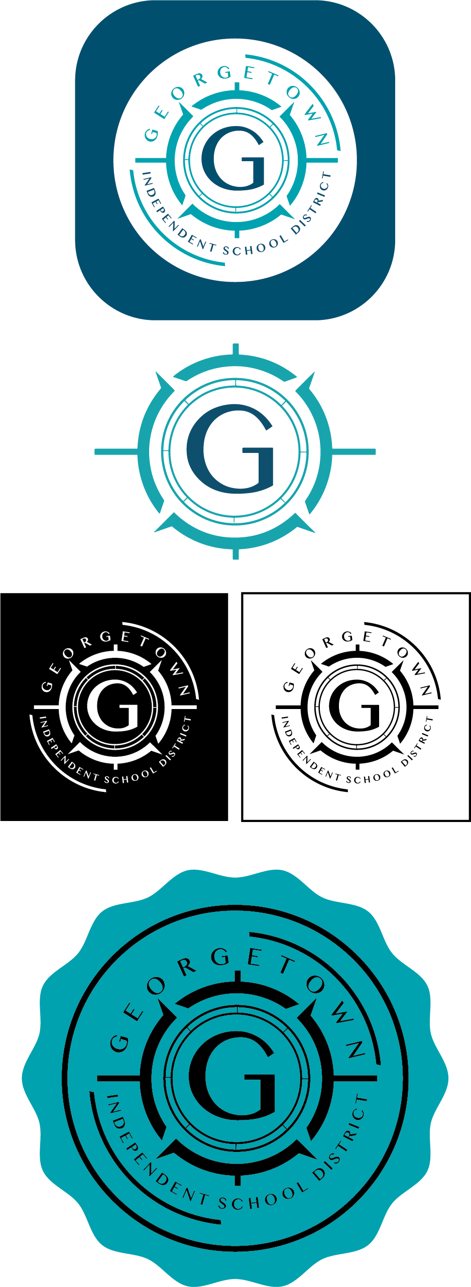
The following are approved alternate versions of our district logo.
White Background Logo: This version of the logo is for use on solid colored or complicated backgrounds to provide legibility.
Simplified Logo: This logo is primarily used for small printing or embroidery projects.
White & Black: Primarily used for printing on black or white backgrounds when high contrast is needed.
The Badge Logo: The badge logo is the newest addition to our alternative logos, created alongside our Only At campaigns. It is an evolution created to meet our current design needs.
While it may be used as an alternative to our standard logo in most use cases, it should not be seen as a direct replacement. If you have questions about usage, please reach out to our office.